

Optimising Eurostar’s App Homepage for Revenue Generation
GOAL
Help the Eurostar app homepage work harder to drive revenue and increase search-to-book conversion.
OUTCOME
Reframed the homepage as a commercial touchpoint, not just a brand space
Created cross-functional alignment on a modular homepage strategy
Established a CMS-driven approach for more agile promo updates
A roadmap of component updates focused on revenue generation
Designs validated through user interviews and qualitative feedback
Early changes (notably the search bar) led to a 6% uplift in searches and 3% uplift in conversion
Set the foundation for longer-term evolution: personalisation, loyalty visibility, and contextual content
ROLE
Experience Design Lead - App
TOOLS
Figma, FigJam, ChatGPT, Jira
DURATION
February 2025 - May 2025
TEAM
UX/UI designers, product managers, engineers, marketing, content, analytics
Objective
Explore how the Eurostar app homepage could become a more functional, engaging, and revenue-generating entry point.
A key opportunity
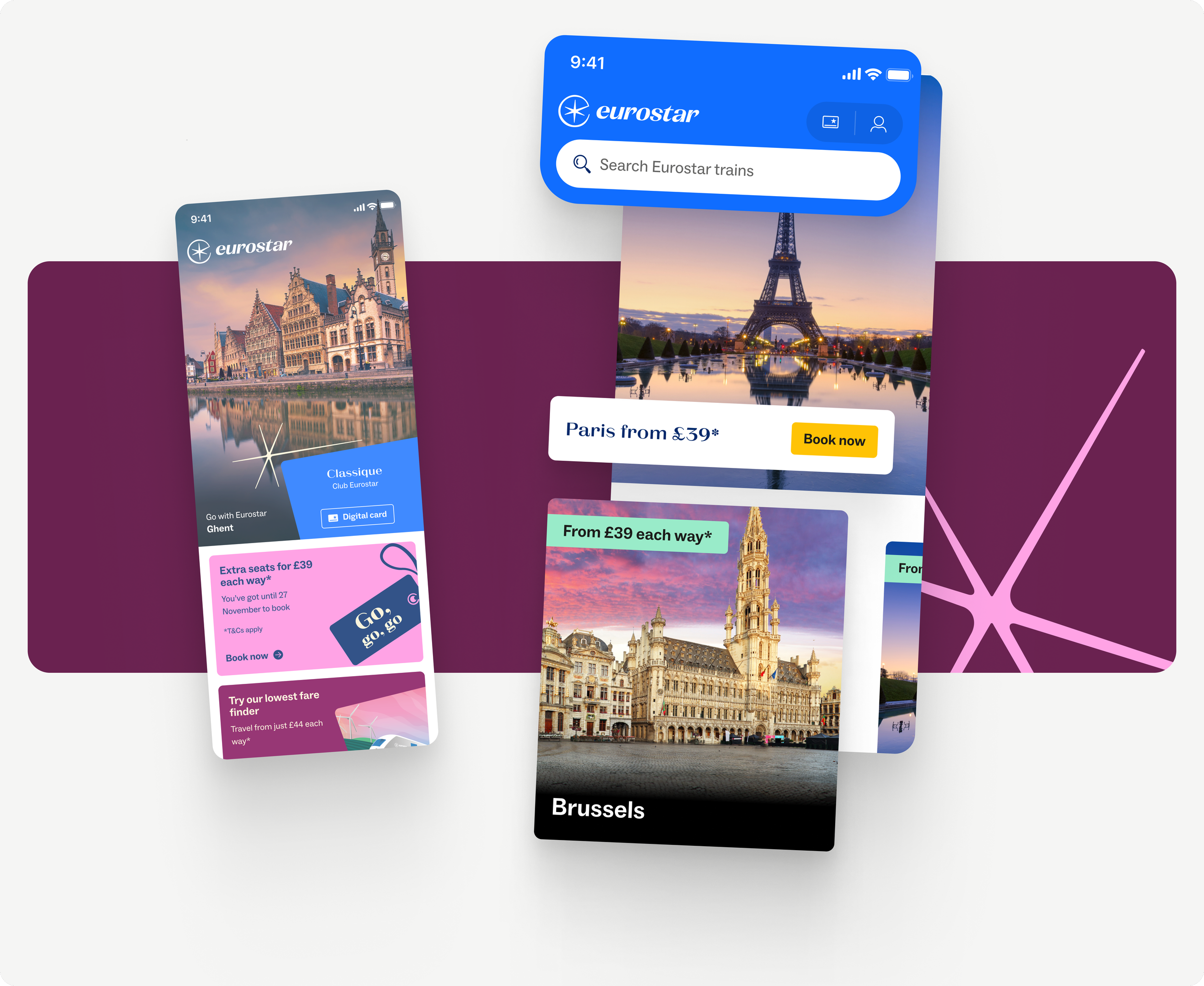
THE EXISTING HOMEPAGE
The existing app homepage wasn’t fulfilling its potential. I identified key commercial and experiential shortcomings:
The static hero image dominated screen real estate without driving action.
As the entry point for new bookings, there was no indication of where to start
Promo components had limited flexibility and impact.
‘Book’ CTAs were low-visibility and poorly placed.
Loyalty benefits were not promoted effectively.
No clear reason for users to log in or create an account.
Content hierarchy wasn’t optimised for engagement.

THE COMPETITOR LANDSCAPE
Before sketching a single wireframe, I benchmarked the Eurostar app against other major travel brands including Trainline, Booking.com, SNCF Connect, and EasyJet.
This analysis revealed a few consistent patterns:
Most brands used their homepages to drive direct actions (search, manage booking) rather than brand storytelling.
High-performing apps made strong use of personalisation, surfacing trip-relevant content or contextual promos.
Homepage real estate was modular and dynamic, with the ability to swap in seasonal campaigns or loyalty nudges.
These findings shaped our hypothesis: if we reframe the homepage as a flexible, commerce-first space - with personalisation and modularity baked in - we could increase engagement and revenue without compromising the brand.
From Ideas to Priorities
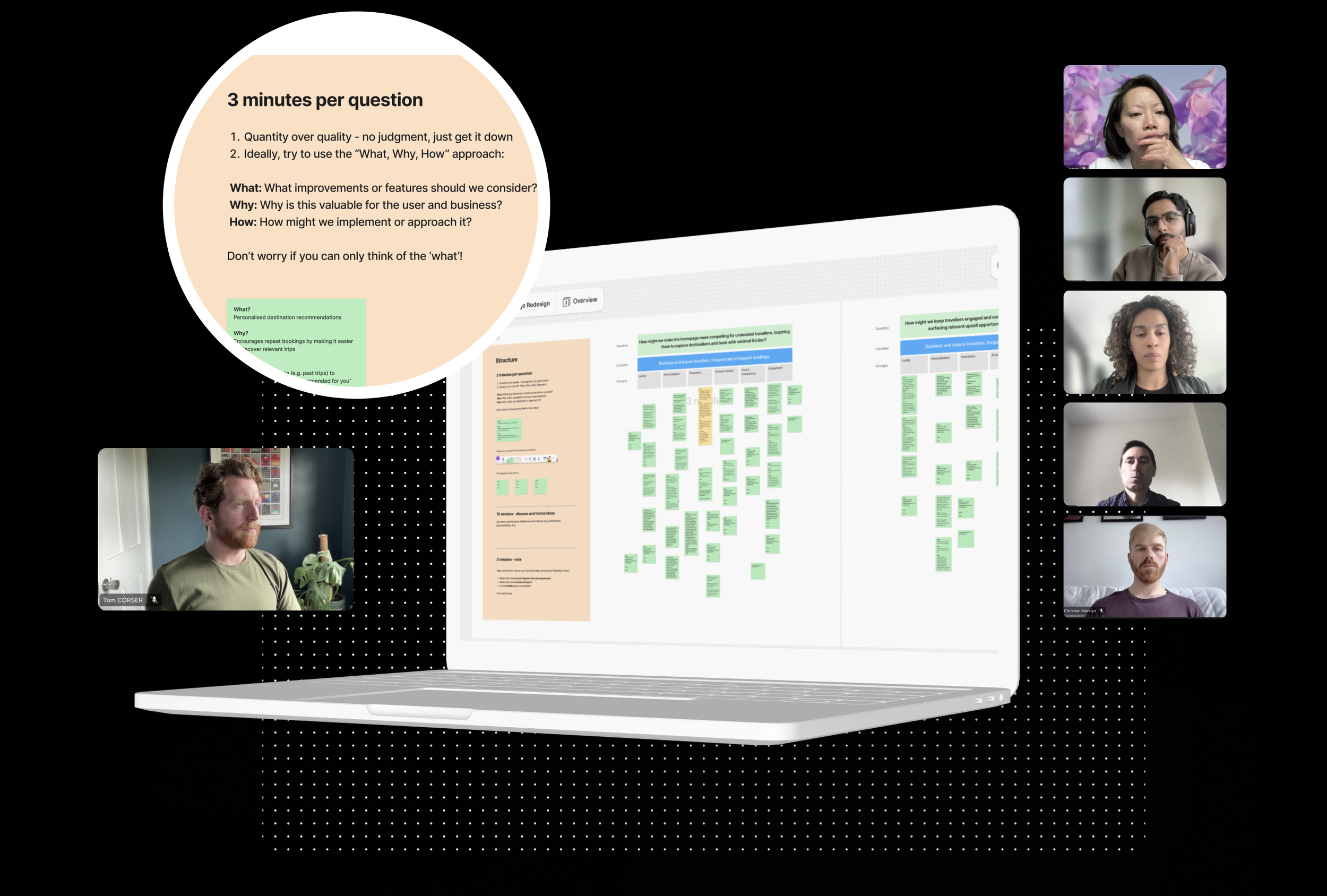
I facilitated a cross-functional ideation workshop involving product, marketing, engineering, and commercial teams. Our goal was to generate as many potential homepage ideas as possible—ranging from quick wins to blue-sky ideas. I ran this as two timed brainstorm sessions around the questions:
How might we make the homepage more compelling for undecided travellers, inspiring them to explore destinations and book with minimal friction?
How might we keep travellers engaged and excited about their upcoming trip, while surfacing relevant upsell opportunities at the right moment?
WORKSHOP & IDEATION

PRIORITISATION
I created a prioritisation matrix to score each idea based on potential revenue impact, confidence in value, and technical complexity.
This scoring approach helped us focus resources on ideas with the greatest commercial and user potential, while shelving or parking those that needed more validation or posed too many technical challenges. These were:
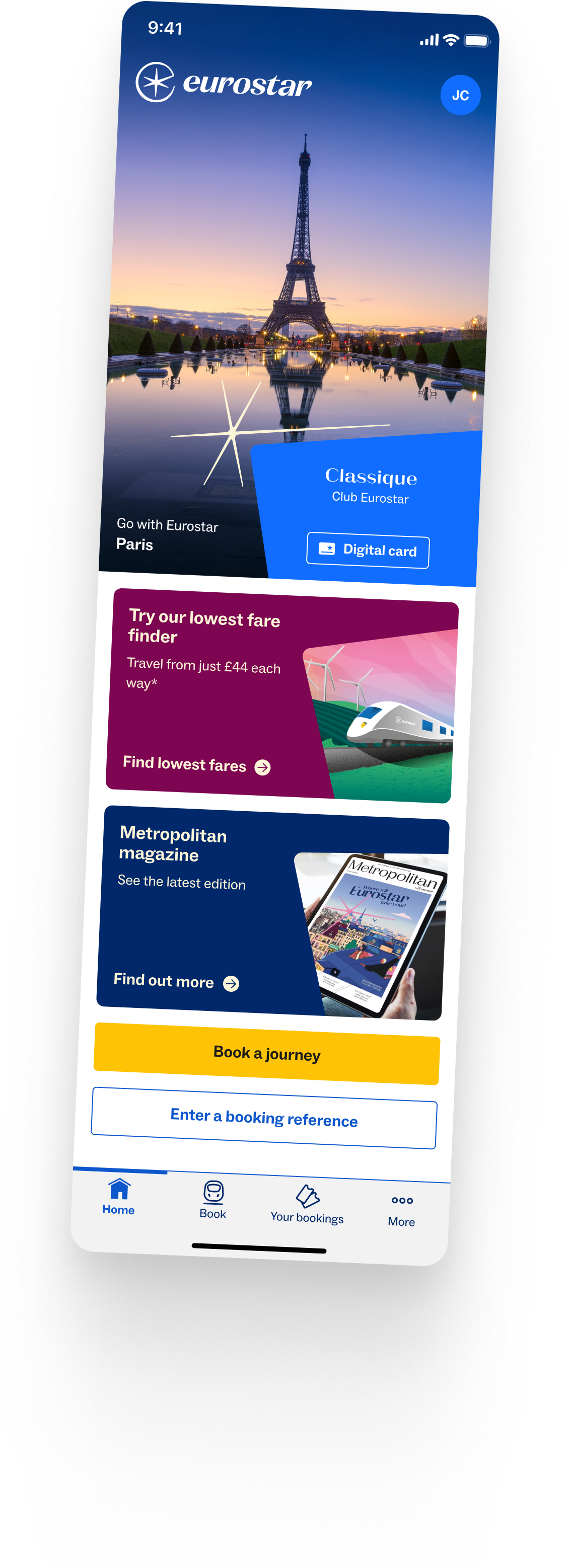
Homepage search bar
Improved hero promo module (CMS-controlled)
Low Fare Finder teaser
Recent searches / follow-on
Destinations widget (showcasing breadth of network)
Account sign-up benefits
Loyalty upgrade banners
Design & Concept Development

LEAN DESIGN TO GAUGE PERCEIVED VALUE
Once we’d prioritised the most promising ideas from the workshop, together with a UI Designer, we created a series of initial module designs to bring them to life. These were prepared specifically for user testing, allowing us to evaluate how well each concept resonated with real users.
The goal was to validate whether our assumptions around value and relevance aligned with user expectations.

REAL-WORLD TESTING: INSIGHTS FROM ACTUAL USERS
I conducted 10 moderated user interviews comparing the current homepage to a new homepage prototype with some of our prioritised module concepts.
Users favourably viewed the visual imagery within the modules and recognised the new search bar as an immediate improvement.
There was a strong interest in integrating fare browsing with destination inspiration, and users noted a need for clearer entry points.
Awareness of Club Eurostar benefits and holiday packages was low, indicating clear opportunities.
Laying the Groundwork for Commercial Growth
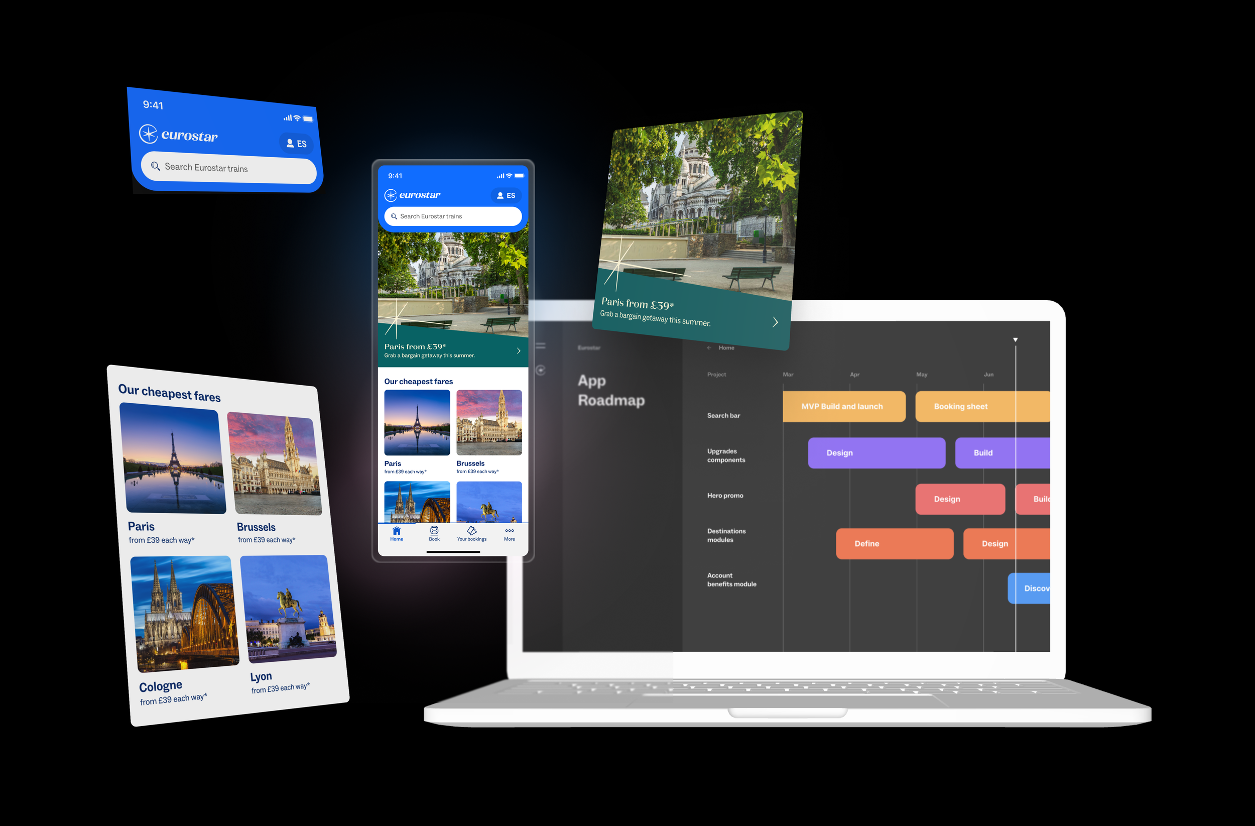
Through structured workshops, prioritisation, user validation, and iterative design, we created a clear, scalable roadmap of homepage updates aligned to specific revenue goals.
Each module was mapped to a business opportunity - whether encouraging bookings, promoting loyalty, or increasing account sign-ups. The roadmap is being rolled out in phases across the year, allowing Eurostar to track performance incrementally and respond to user behaviour over time.
This work has helped shift the role of the homepage from a passive brand space to a dynamic, commercially effective surface - with a clear plan for how each component contributes to both user experience and commercial return.
Impact and Learnings
Collaborating with the PO’s, the new homepage search bar went live as an A/B test to measure its impact. Early results showed a 6% uplift in searches and a 3% improvement in conversion. Perhaps more importantly, the framework now allows the team to test and iterate on homepage content more freely - with commercial, product, and brand teams all aligned on how modules should behave.
Additional modules are being rolled out over the next 6–12 months, so full impact data is not yet available.
This project highlighted the value of early alignment, structured prioritisation, and user-led iteration. Rather than chasing a single ‘perfect’ homepage, we built a flexible foundation for continuous iteration.